Pantone Color Institute has released its color report for Spring2013. While its fall and the next spring is a little far to come, we couldn’t wait to see the expected jewelry in style. After all it is good to be prepared for the upcoming season’s fashion.
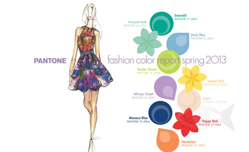
Leatrice Eiseman, executive director of Pantone Color Institute, explained the balancing power as the inspiration behind the latest forecast. The novel neutral shades are the focus of the new list where it shows the balance between light and bright. Colors are a means of self expression and as colors to explain balance have never been in thoughts earlier, sense of balance is a theme of Spring2013 colors prediction.
So here we go with the Pantone 2013 spring colors in jewelry:
Monaco Blue:


A hybrid of cobalt and dull navy, this anchoring color is loved by Tommy Hilfiger, Lela Rose, Herve Leger and Tia Cibani for its wear ability. Leatrice describes Monaco blue as ‘classic shade offering stability and depth to the entire palatte.’
Dusk Blue:


It is a neutral color to bring calm and serenity. Blue is a neutral color of nature and this shade reminds of the early morning sky when everything is quite and relaxed.
Emerald:

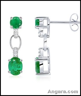
Emerald is a little more vivid of the palette. This brighter color has a sense of clarity and an emerald sparkle attached to it. It is one of the favorite red carpet shades in jewelry and often donned by celebrities. Also being the signature color of spring, it has every reason to get embedded in your mind with a great effect.
Grayed Jade:

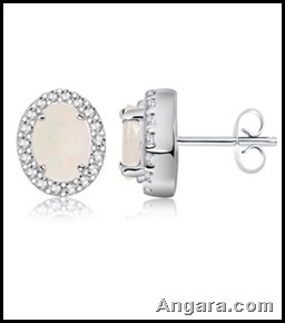
Another neutral shade for spring 2013 Grayed Jade as the name sounds has the color of Jade with a strong grey undertone. A sophisticated touch with a calming influence is what this member of green family can relate to.
Linen:
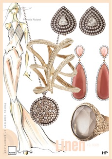

Linen is another version of the kind of nude shade that gives a very light and airy feel. It’s a neutral color that is a must have for spring.
African Violet:
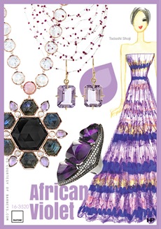

It is a floral color with an exotic touch. It’s not a bright purple but the one with a little kick for spring.
Nectarine:

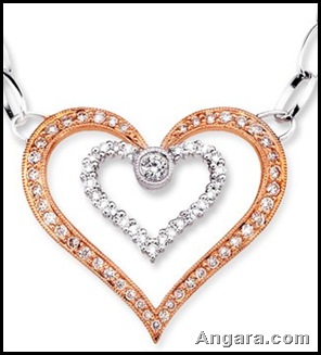
This could be called a less-closer cousin of tangerine. The color has a strong presence with warm coral touch. It’s a lovely skin flattering shade that suits to different complexions.
Tender Shoots:
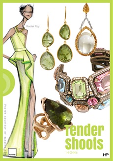
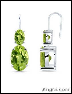
Another exuberant, fun color from the green lineage, Tender Shoots with its yellow-green tint will beautifully represent spring.
Poppy Red:
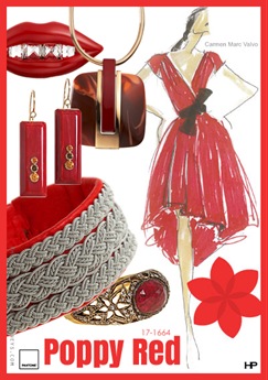

Like green, red is a standby color for the season. But this time it is popping out at us. Poppy Red is a wonderful color for combining and its gaining popularity in the sparkling world.
Lemon Zest:


It’s a wonderful balancing color in the palette. With a zesty component that makes you smile and take a moment to cheer, the color is a strong attention-getter.
0 comments:
Post a Comment